Providing a standard protocol for external users to understand well-being measures from WISE's How's Life? dataset
An MCP server that lets any MCP-compatible AI assistant query the OECD's How's Life? well-being database in plain language, and answer the way the How's Life? 2024 report does.
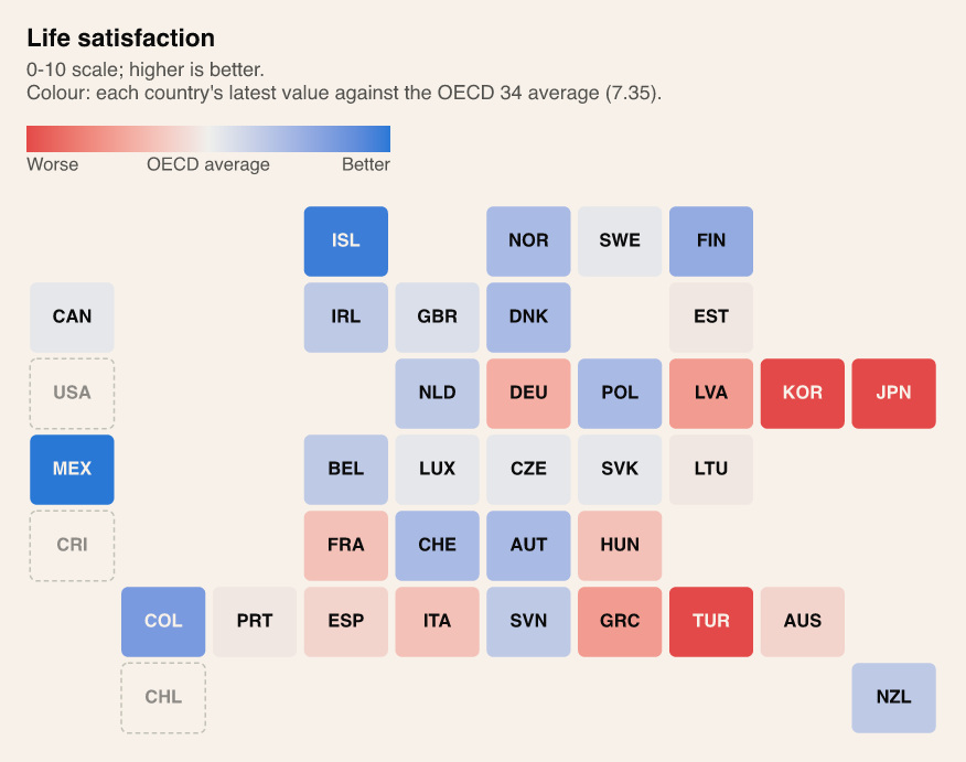
Source: OECD How's Life? well-being database. Methods: How's Life? 2024.
The idea
The OECD publishes the whole How's Life? database through a free SDMX API. Getting the data is easy. Reading it the way the OECD reads it is not, because a lot of the method lives in the report rather than in the data. The OECD average is a simple mean over member countries only, each at its latest year. A change only counts as "improving" once it passes a threshold set for each indicator. Which 36 of the 103 measures are headline indicators, and whether higher or lower is better for each, is listed only in the report.
Model Context Protocol, as the name suggests, allows for a series of protocols - the MCP server builds the method into the tools, so every question about a measure gets handled the same way. For example, there are measures where the goal is balance rather than more or less, such as soil nutrient balance. A surplus of nutrients could pollute water and a deficit drains the soil, so the best value is the one closest to zero, not the lowest or the highest. I decided to standardize the gender wage gap in the same way - no gender wage gap is the ideal outcome. The server ranks these by distance from zero.
Data decisions like the above are made once by the organization that hosts the server and maintains its code, rather than by each user. I believe that today, most users of the dataset write their own scripts, and each user ends up cleaning and standardizing the values a little differently. With the standards built into the server, users can ask their question directly and get answers that are comparable from one person to the next. Every answer also carries its year, says how many members the OECD average covers, and passes on caveats like series breaks and estimated values.
Different methodologies, different results
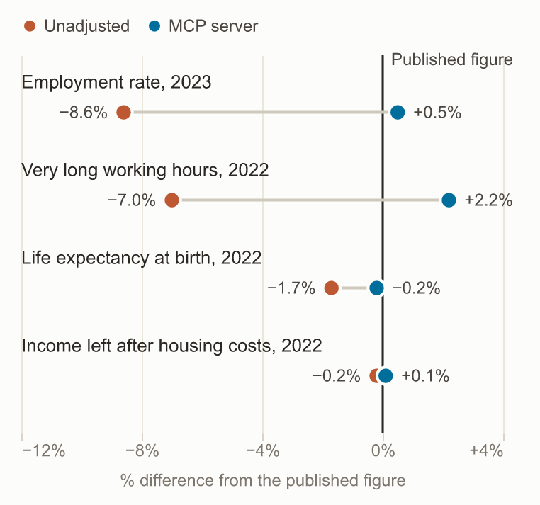
To check, I wrote sample questions and answered each one twice from the same data: once with an unadjusted first pass using Python's pandas library (without any of the data adjustments I built in, such as for measures of balance), and once through the MCP server's analysis layer with standardized computation. I then compared both answers to the published figure in the How's Life? 2024 report, where it gives one.
Show the numbers
| Question | Published | Unadjusted | MCP |
|---|---|---|---|
| OECD average life expectancy at birth, 2022 | 80.7 | 79.3 (−1.7%) | 80.6 (−0.2%) |
| OECD average employment rate, 2023 | 78.0 | 71.3 (−8.6%) | 78.4 (+0.5%) |
| Share of employees working very long hours, 2022 | 7.1 | 6.6 (−7.0%) | 7.3 (+2.2%) |
| Income left after housing costs, 2022 | 79.0 | 78.8 (−0.2%) | 79.1 (+0.1%) |
These differences go to show that users may use different methodologies, leading to different output numbers, which could potentially lead downstream users of the same dataset to different conclusions. The unadjusted numbers aren't far off because of bad arithmetic. They are off because the raw table mixes partner countries and breakdown rows (women, men, age groups) in with the member totals. The other 16 questions show the subtler traps:
- Direction. Sorted high to low like most measures, the "best" homicide rates are the highest ones. Nothing in the data says lower is better.
- Pooled periods. Trust in government is a three-year pooled survey value repeated for each year, and the series starts in 2006. Unadjusted, trust in France "improved" since 2010. On the report's terms it deteriorated, from 44.3% to 37.3%.
- Units. Greenhouse gas emissions are labelled kilograms per person but the values are tonnes, so a literal reading understates France's emissions a thousandfold.
- Stale data. Job strain was last measured in 2015. An unadjusted "latest value" returns it with no warning; the MCP server says so.
- Missing indicators. The headline gender gap in feeling safe at night isn't in the database at all. It has to be computed from the breakdown by sex.
I documented every quirk like these in the repo as I found it. The method is covered by 272 offline tests, plus live checks against the real API that run only when asked for, to spare its rate limit.
Tools available to AI assistants
The server exposes eleven read-only tools. The assistant picks them
itself, so a question like "Is life expectancy in the US
improving?" becomes a trend call, and
"How is France doing on well-being?" becomes a single
country_trends call that classifies all 36 headline
indicators at once.
| Tool | What it answers |
|---|---|
find_measures | Which measure covers a topic ("NEET", "trust") |
describe_measure | Unit, which direction is better, the threshold for meaningful change, coverage |
compare_countries | Members ranked on one measure, against the OECD average |
trend | Improving, deteriorating or no clear change, since around 2010 or since 2019 |
group_gaps | Women vs men, age groups or education levels |
country_profile | A country's headline indicators: strengths, weaknesses, rank |
country_trends | All 36 headline indicators for one country, improving or not, in one call |
better_life_36 | An overall well-being score, with optional weights per dimension |
suggest_charts | Up to four charts that fit the question |
show_chart | One chart full size, with its data as a table |
custom_chart | A chart no template covers, labelled as custom |
There is also a Country well-being briefing prompt that writes a How's Life?-style note on any member country.
Interactive charts
Since I used Claude Desktop for this app, this is how I ran
workflows. show_chart opens an interactive panel, an
MCP App connected to the server, where you can hover for exact
values and switch between suggested charts. The panel also tells Claude which chart is on screen, so you
can ask about what you're looking at.
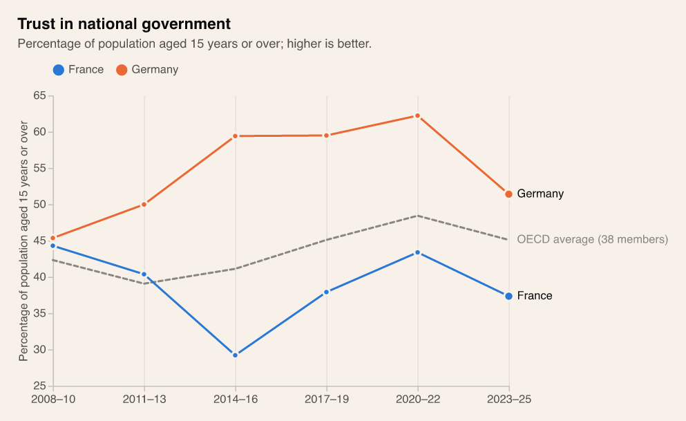
Source: OECD How's Life? well-being database. Methods: How's Life? 2024.
A question like "Where is the gender gap in feeling safe at night
widest?" would typically call group_gaps, which compares women and
men on that measure in every member country. show_chart
then draws the result:
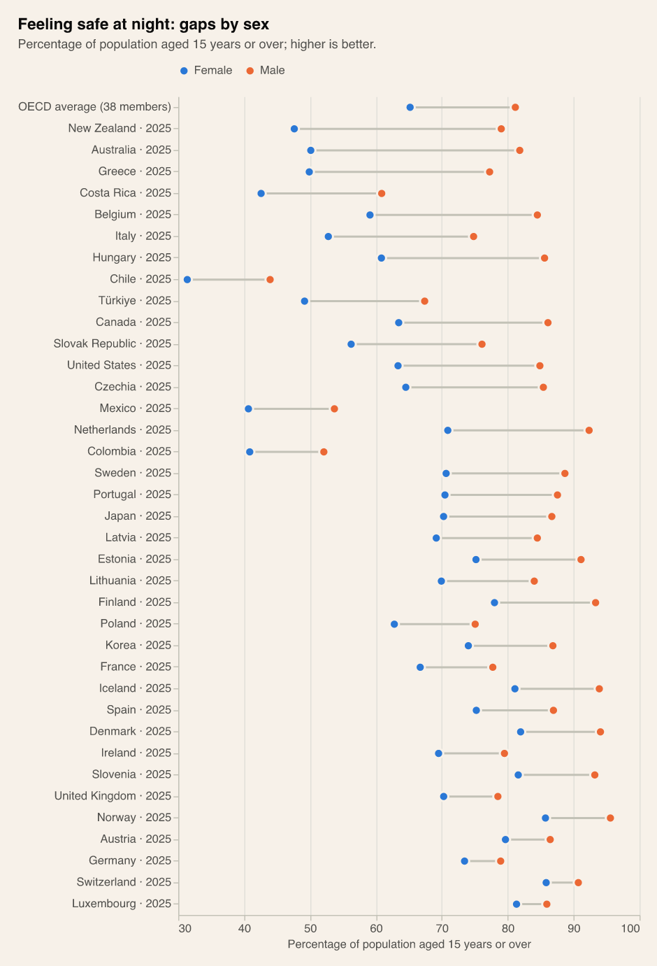
Source: OECD How's Life? well-being database. Methods: How's Life? 2024.
How it's built
- OECD API The whole database in two SDMX requests. The API allows about 60 an hour, so nothing else touches it.
- Local cache About 150,000 rows in Parquet, refreshed every 30 days. Every tool answers from here.
- Analysis The How's Life? 2024 method in pandas: member averages, thresholds, gap ratios, headline indicators, data fixes.
- MCP server Typed tools, chart templates in Altair, and an MCP App panel in Claude Desktop. Other clients get PNG charts.
MCP is an open standard, so the server isn't tied to one assistant: any MCP client can use its tools. I built and tested it with Claude Desktop. It runs locally for now, so a web-based assistant such as ChatGPT would need it hosted over HTTP first.
- Language: Python 3.12, managed with uv
- Server: the official MCP Python SDK, with MCP Apps for the chart panel
- Data: httpx for the SDMX API, pandas and Parquet for the cache
- Charts: Altair (Vega-Lite), rendered offline with vl-convert
- Quality: pytest, ruff, GitHub Actions
What's next
- Controls in the chart panel to change countries and the baseline year
- The report's rule for whether a gap between groups is widening or narrowing
- Evals with Claude itself answering from the raw data vs the tools, graded automatically
- Bulgaria, once it joins the OECD
Code
The code is on GitHub, along with the full evals (every question, both answers and why they differ) and a list of every data quirk the server handles.
Return to main